Sep 3, 2024
Contents
Introduction
Overview of Figma Conditional
Use Cases > Instance 1: Crafting Dynamic Checkbox Dropdowns
- Problem Statement
- Why use conditional values for checkboxes?
- SolutionConclusion
References
Introduction
As a long-time Figma user, I've come to expect the unexpected. Just when I think I've mastered the platform, Figma unveils another innovative feature that expands the horizons of design possibilities. Recently, I had the chance to explore one such game-changer: the 'conditional' feature in Figma's prototyping section.
This powerful tool, which employs if/else logic, has revolutionized my approach to creating seamless flows and prototypes. The simplicity and flexibility it offers is truly remarkable. In this post, I'll share two specific cases where I've applied conditional logic, demonstrating how it has transformed my design process and opened new creative avenues.
Ready to dive in and discover how this feature could elevate your Figma game? Let's explore!
Overview of Figma Conditional
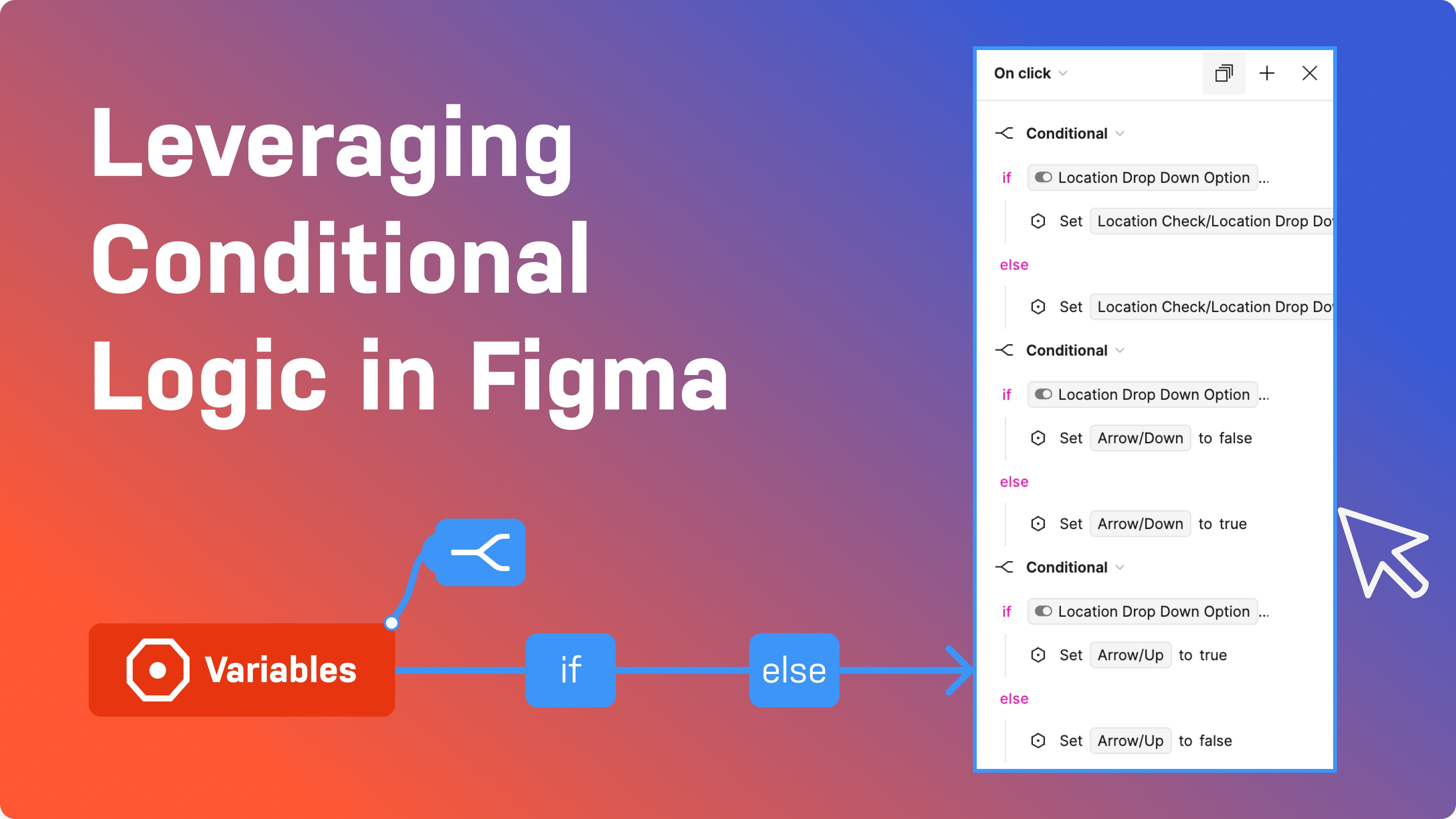
Imagine a prototype that adapts to user choices in real time, creating a truly interactive experience. That’s the power of conditional logic in Figma. This feature allows designers to set up rules that determine how a prototype behaves based on specific conditions. Whether it shows different screens based on user input or changing elements depending on the state of the design, conditional logic brings a new level of sophistication to Figma prototypes.
Conditional logic in Figma is a game-changer for designers. By enabling the creation of dynamic and interactive prototypes, it significantly enhances the design process. Prototypes closely resemble real applications, facilitating accurate user testing and early identification of issues. Moreover, conditional logic streamlines workflow by reducing the need for multiple static prototypes and ensuring efficient handoff to developers through clear communication of design intent.
Let’s explore the use cases.
Instance 1: Crafting Dynamic Checkbox Dropdowns
Problem Statement
When designing a checkbox dropdown with multiple options, each possible combination of checkbox states requires a separate component. This results in a proliferation of components, which can be cumbersome to manage and update. As the number of checkboxes and options increases, this method becomes increasingly complex and inefficient.
Why use conditional values for checkboxes?:
Efficiency: Creating a single, dynamic checkbox dropdown component with conditional variants reduces the need to design and manage numerous static components. This streamlines the design and prototyping process, saving time and effort.
Maintainability: Fewer components mean there are fewer elements to update and maintain. Changes to the dropdown’s design or functionality can be applied globally rather than needing to be replicated across multiple components.
Consistency: By using conditional logic within a single component, you ensure that the dropdown’s appearance and behavior remain consistent throughout the design. This avoids discrepancies that can arise when manually managing multiple component states.
Scalability: As new options or checkboxes are added, a single component with conditional variants can easily accommodate these changes without needing extensive redesign or additional components. This makes it easier to scale your design as requirements evolve.
By leveraging Figma’s conditional variants and Boolean variables, you address these issues, making the prototyping process more efficient, maintainable, and scalable.
Solution
It feels like magic when you first encounter the concept, but Figma truly works wonders. Let’s dive into how you can create a checkbox dropdown using these conditional values.
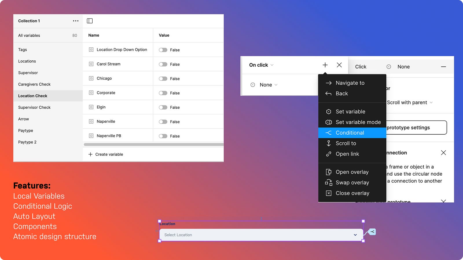
Let’s break down the process of implementing conditional logic in Figma:
Identifying the condition: To begin, it’s crucial to identify the condition and understand the different outcomes it will trigger. In this scenario, our goal was to create a multi-selectable checkbox dropdown.
Conditions:
If a checkbox is selected, the corresponding option is added to the input field.
If a checkbox is deselected, the corresponding option is removed from the input field.
The input field dynamically updates to reflect the selected option.
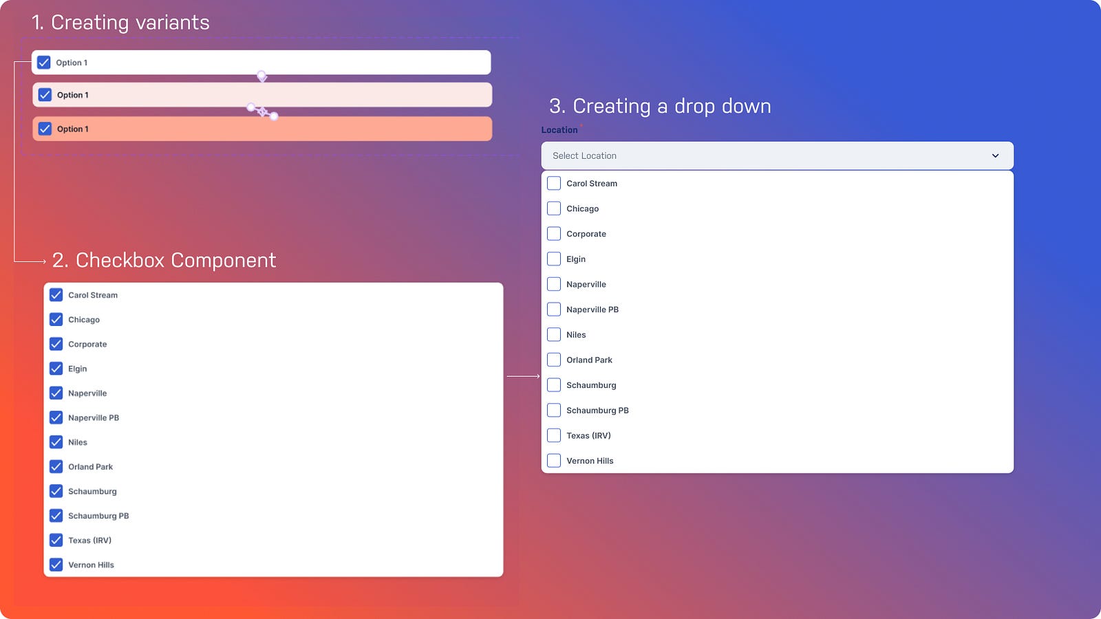
2. Creating a component: Let’s start building the design. We created components for both checkbox and dropdown options. See the image below.
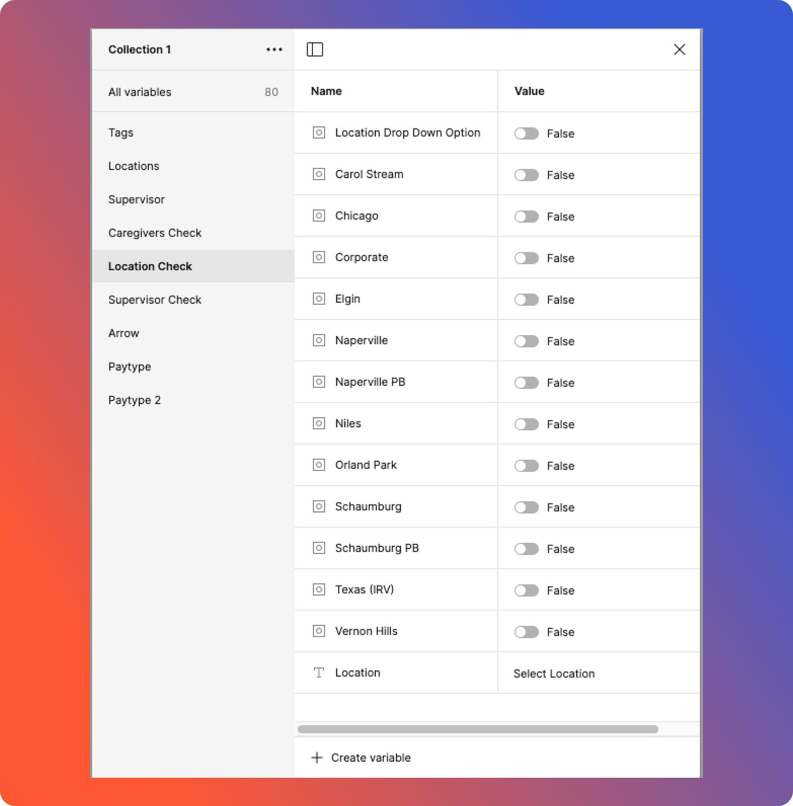
3. Creating Boolean Variables: Once the components are created it’s time to create Boolean variables and one string variable for input field default text (select Location). There will be three kinds of Boolean variables created:
Dropdown state: Indicates whether the dropdown is open or closed.
Options: Individual options inside the drop down.
Dropdown icon direction: Controls the orientation of the dropdown icon (up or down).
4. Setting up the trigger: After creating Boolean variables, connect them to control content visibility. In the layer panel, right-click the eye icon of the target content and choose the appropriate Boolean variable. As the default is false, the content will be concealed until the variable’s value changes.

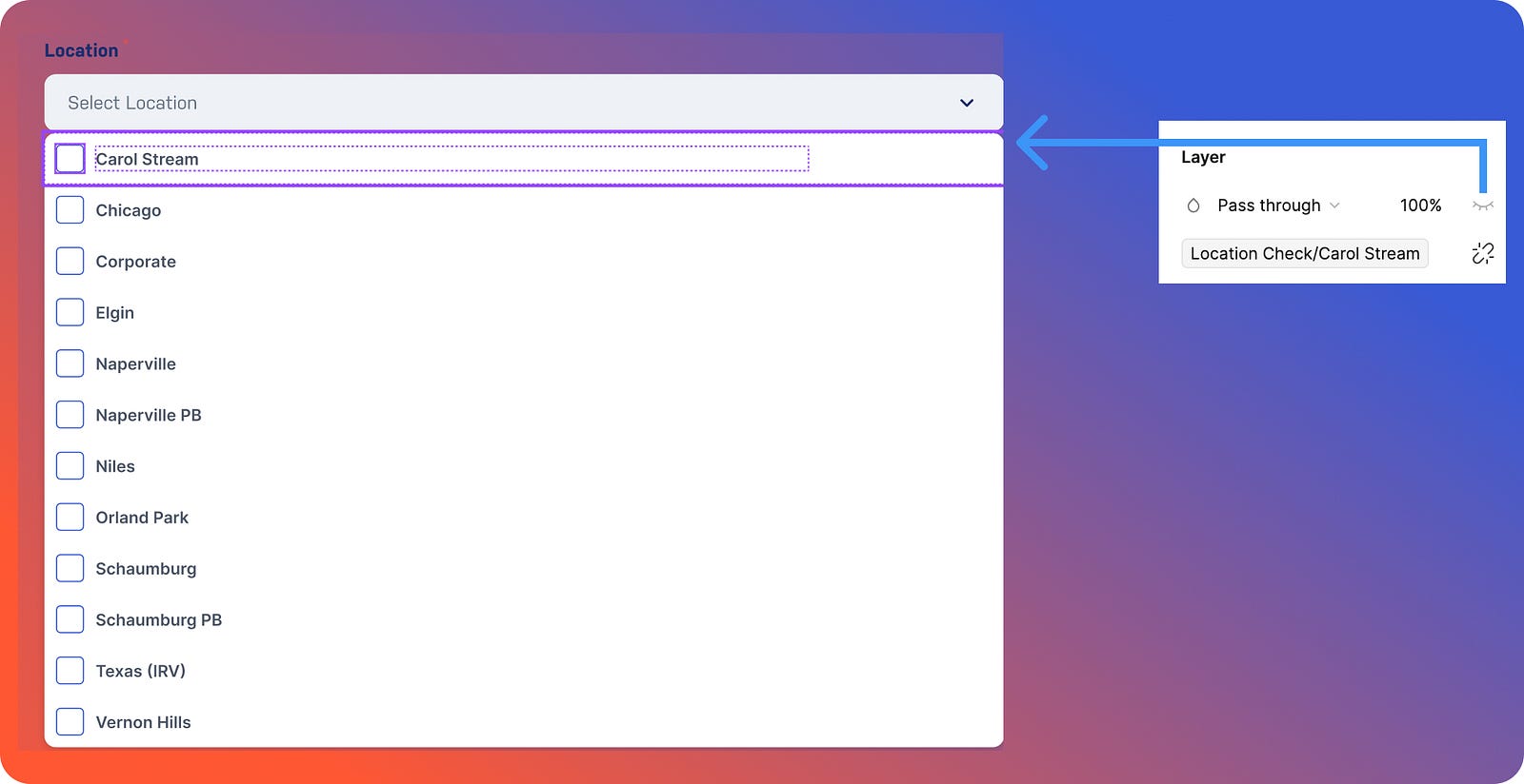
5. Connecting the checkboxes: To enable multi-selection and link checkboxes to specific content, connect each checkbox layer to its corresponding Boolean variable. For instance, when the “Carol Stream” checkbox is checked, the associated Boolean should switch to true, displaying “Carol Stream” in the input field. Conversely, an unchecked checkbox corresponds to a false Boolean state, hiding the content. (Refer to the image)
6. The final step: Let’s set the conditional logic. Conditional logic will be set in two places:
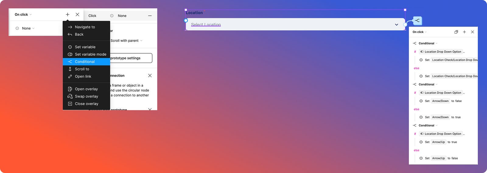
Input field: Three conditional logic rules will be established. One will determine when to open or close the dropdown menu, while the other two will control the visibility of the up and down arrows based on the dropdown’s state. (Refer to the image)
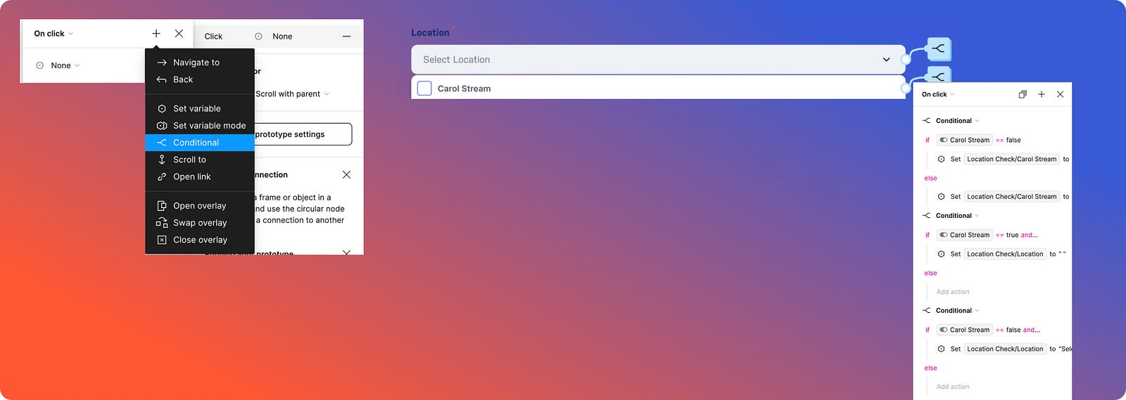
2. Drop-down options: The most exciting part is setting conditions for each dropdown item. We’ll be implementing three conditions: one for when an option is unchecked, another for when it’s selected, and a third for multiple selections. As shown in the image, we also need to set a condition where if a location is selected, the default placeholder text (“Select Location”) is cleared, leaving it empty, and the selected locations are displayed instead.
Later, we can set the dropdown to “false” in the local variable, and it’s ready to be used in the design.
Conclusion
Figma's conditional logic has completely changed the way we approach prototyping by providing a degree of interactivity that almost exactly resembles real-world applications. We've seen how conditional logic can simplify complex interactions and make prototypes more engaging and user-centric by creating dynamic checkbox dropdowns. In addition to improving the prototyping process, having the ability to dynamically update content based on user actions also makes communication with developers clearer and guarantees that the design intent is accurately transferred into the finished product.
As designers, we are always looking for tools that allow us to push the limits of usefulness and originality. That's exactly what Figma's conditional logic accomplishes; it lets us create more complex, responsive, and understandable designs. Utilizing this capability may improve our prototypes to new levels and produce user-resonant experiences. Therefore, give conditional logic a try the next time you're working on a Figma project, and you'll see your designs come to life in unexpected ways.
Remember: The key to successful implementation is careful planning and a clear understanding of your design goals. By breaking down complex interactions into smaller, manageable steps, you can create seamless and engaging prototypes that truly impress.
References to Figma Tutorials
For those who want to learn the basics of using conditional logic in Figma, the following online tutorials are recommended:
Happy Prototyping & Stay Tuned for Case Study 2!

